Capturing precious moments
Neat Photo Booths
Looking Good
Neat Photo Booth was founded in 2015 by sisters Candyce Morris and Nicole Bhar with their spouses Matt Morris and Paula Shyba. The venture began when they identified an opportunity in providing the ability to capture priceless experiences in an intuitive and pressure-free environment. Fast forward a few years and Neat is an established company with a quickly growing field of competitors. Wanting to stay ahead of the game, Neat partnered with Onetwosix Design to assess their product and redesign their booth to surpass their competitors for years to come.
Putting the Problem Into Focus
Onetwosix performed an assessment of the existing Neat Photo Booths and their competitor products to determine how a redesign could address existing needs. Focus was placed on size, weight and ease of transportation, but we knew we had to consider the full experience of using the booth. How could we design a Photo Booth that was as enjoyable to set up as it was to use?
Finding Direction
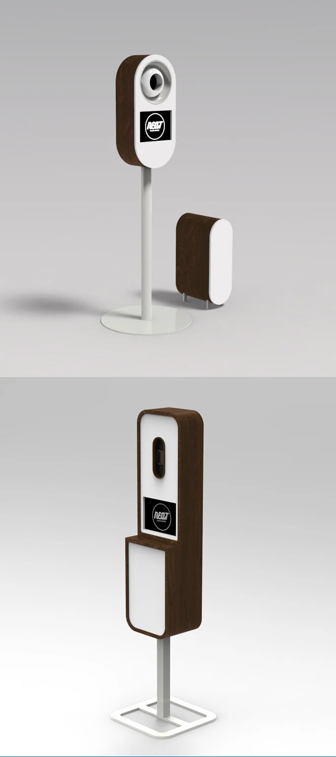
Aesthetics would play a major role in the redesign. The finished booth would need to: have an intuitive interface; appear friendly and approachable to encourage interaction; have curved surfaces and attractive materials able to house the necessary components; and have a visually distinctive style that set it apart from the competition. Sketches and 3D models led to refined concepts, with the chosen concept striking a balance between retro and futuristic.
Preparing for Production
Before making the chosen concept a reality, we made use of an accurate cardboard prototype to test dimensions and quickly make any necessary changes. This inexpensive process ensures there is no miscommunication between concept and finished product and physical interaction with the prototype means we can test ergonomics before going forward.
Capturing your
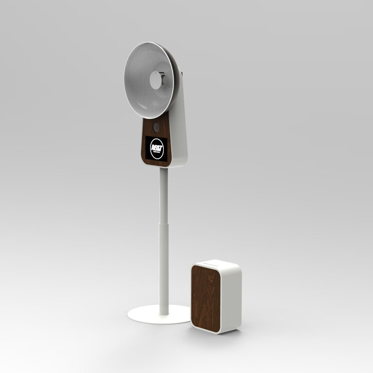
The final design integrates Photo Booth and reflector into a single form. Joining the two components mimicked the visual cues of 1950s flash cameras, creating a retro feel with an immediately recognizable function. The curved surfaces make for an approachable product and the vibrant white powder coated aluminum and warm walnut accents brighten any space it happens to be placed in. The unit also quickly breaks down and packs up for easy transportation and storage making it a pleasure to set up and a joy to use!
#twinning
In order to keep the Photo Booth from becoming bulky and awkward, the printer was made to be a separate element with just as much character. The printer unit was designed to compliment the main body using similar visual cues and materials with a built-in catch for the printed photos – quirkiness and function in one small package!


